A recent ReadWriteWeb article on VisualComplexity.com caught my attention the other day, triggering some thoughts about the underutilized potential of visualization in marketing analytics.
Generally speaking, marketing isn’t hindered by a lack of data these days. To the contrary, the challenge for many marketers is the exact opposite: they are deluged with data. It’s a syndrome marked by being up to your eyeballs in reports and dashboards, but feeling short-changed on meaning and insight from them.
Particularly when it comes to web analytics and online behavior tracking, one can easily be cornered between two extremes:
- super high-level dashboards (overall metrics for traffic, conversion rate, CPA) that lack sufficient fidelity to explain the forces driving those metrics;
- very detailed reports — i.e., any report longer than one page — that are difficult to extract meaning from because there are too many rows and columns in table after table, too many pie charts and bar charts with varying scales, and it all starts to blend into a fuzzy analytical haze.
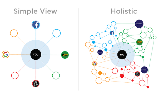
From cognitive science, we know two things: (1) humans are fantastic at visual pattern recognition, and (2) humans are also wired to tune out background scenery and focus on the new and different. The latter is a feature, not a bug: consider the oft-repeated example of your distant ancestors detecting the tiger moving among the trees, while less attune to the static details of the surrounding flora.
Taken together, these ideas suggest an opportunity for marketers to learn from fresh and different visualizations of their data. Shake it up. As the saying goes, “It’s all a matter of perspective.”
I believe that one of the roles of marketing technology should be more proactive exploration of visualization in marketing analytics — with the goal of revealing meaningful patterns. (“Meaningful” = actionable insight that increases business.)
The graphs, maps, and images on VisualComplexity.com are a great inspiration for this. Of course, there’s always Edward Tufte’s collection of visualization masterpieces: The Visual Display of Quantitative Information, Envisioning Information, Beautiful Evidence, and Visual Explanations.
In more day-to-day analytics visualization, take a look at Information Dashboard Design by Stephen Few — excellent visual design recommendations, with plenty of examples, for making those dashboards as effective as they can be.